Oaza, founded in NYC, is a line of electrolyte-infused premium cold brew coffee. They were developed so the modern athlete can start their day by enjoying a light, refreshing cold brew coffee with the functional benefit of hydration through a blend of electrolytes similar to sports drinks.
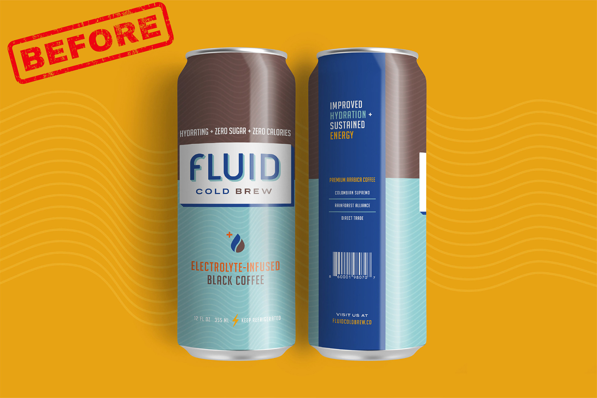
In November 2020, they rebranded from Fluid Cold Brew to a new, more meaningful brand name, Oaza. The name Oaza translates to Oasis, a place where you’ll find refreshment in a place you’d least expect.Reflecting their new brand name in a creative way was going to be extremely important and also a big challenge.
Our mission was to help them with new, and exciting content that would better target & engage their audience, while improving brand awareness.
Challenge
They felt their old branding, while successful, didn't reflect the energizing, premium aesthetic and hydration messaging they always targeted. They wanted to create a new brand identity that reflects their core values.Outcome
We helped them create content that aligns with their new, refreshed look and attract their target audience to their website & social platforms to drive growth. They have seen more brand confidence, new partnerships created, and increased sales.
Services
Creative Direction
Motion Graphics
Photography
PRESS
BevNET.com
Columbia Business School
THE GOAL
Their mission was updating their content to reflect their new brand name, brand messaging and brand confidence for their premium products. The expectation was that this would lead to an increased customer acquisition, better engagement on their platforms, and new partnerships.
Our mission was to help give them creative direction and design content to reflect their premium brand identity across all outlets.
THE CHALLENGE
As a growing company, they knew they had to provide new content to match their rebranding and needed some guidance with that creative direction. Social media was their primary advertising space and they wanted to have more impactful engagement. They are a small team, and knew they needed to get a fresh perspective and were looking for a different approach.
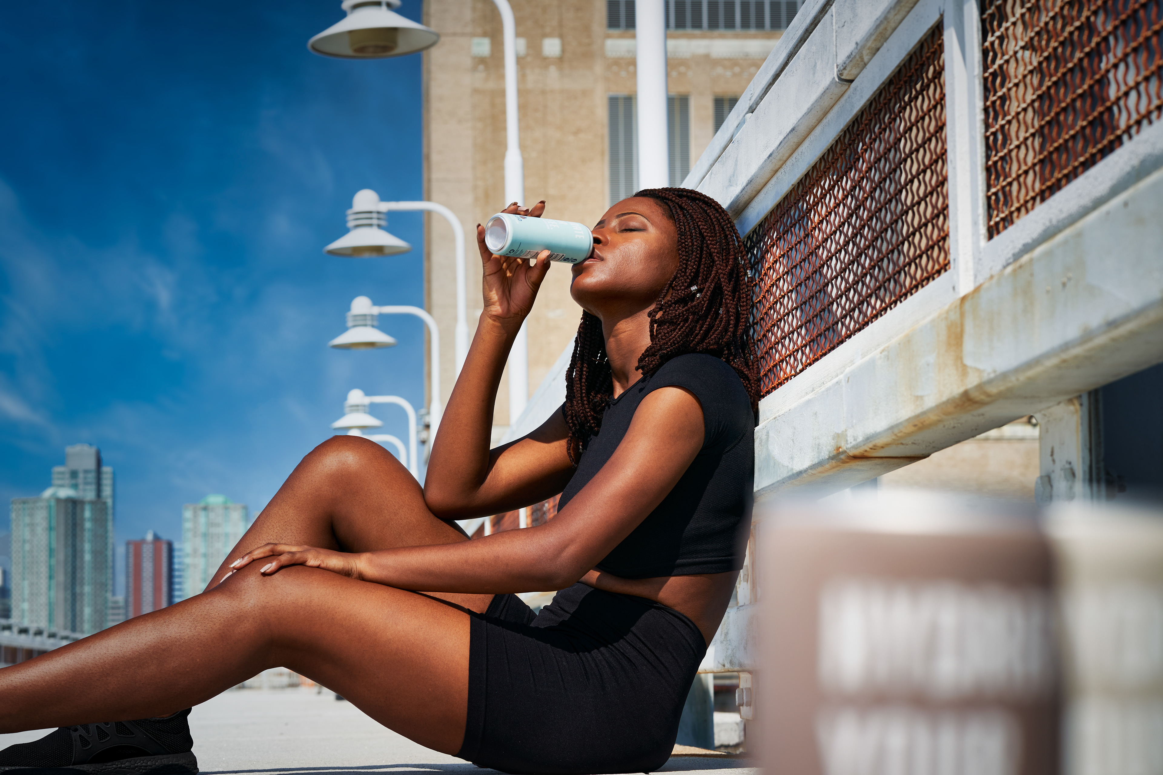
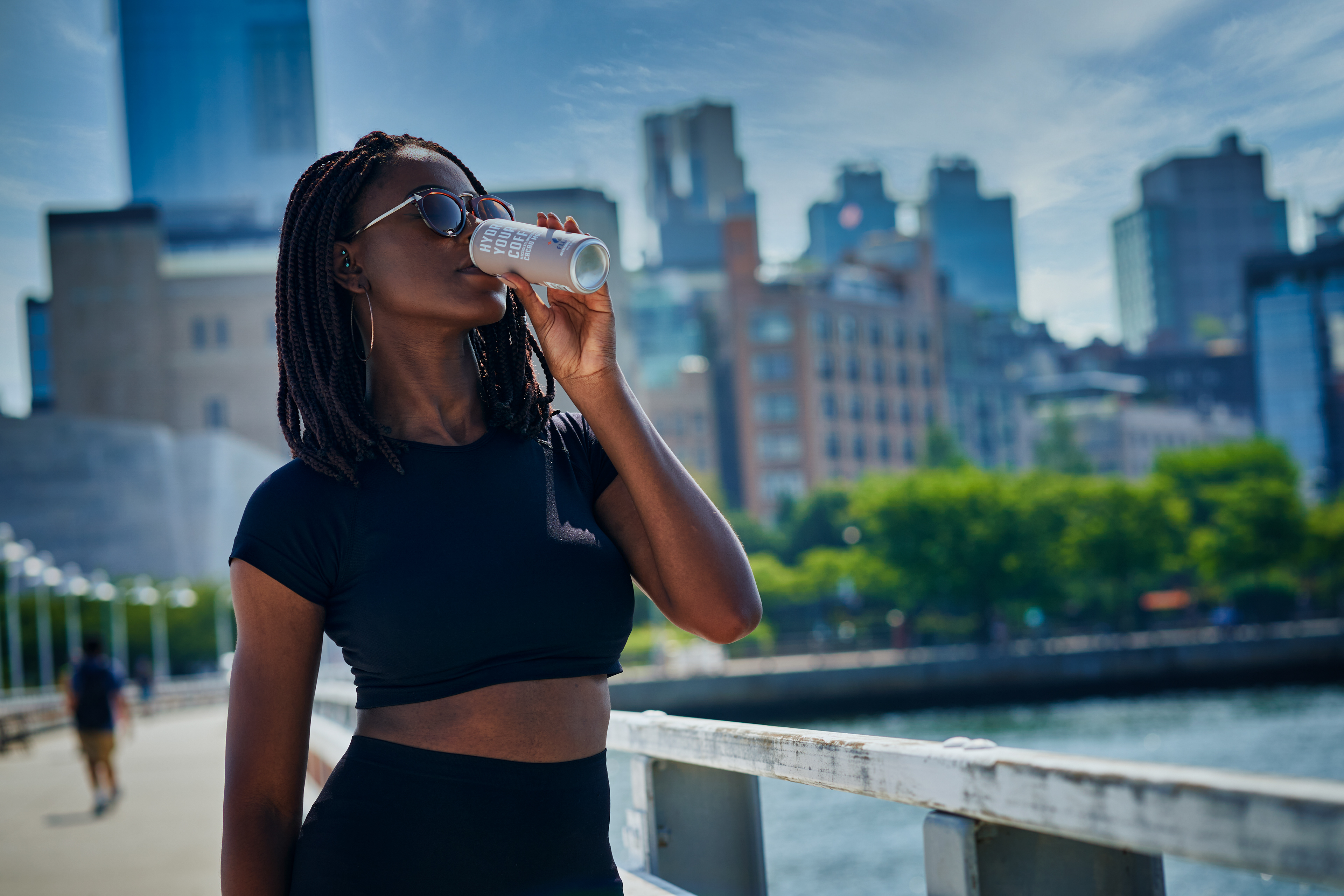
Coffee is the least hydrating staple beverage. They wanted to reinforce their unique value proposition of coffee that also hydrates, while showcasing that they are a premium brand.
DEVELOPING THE creative direction
We sat down with their CEO to better understand how they would differentiate from their old brand messaging, aesthetics & content strategy.
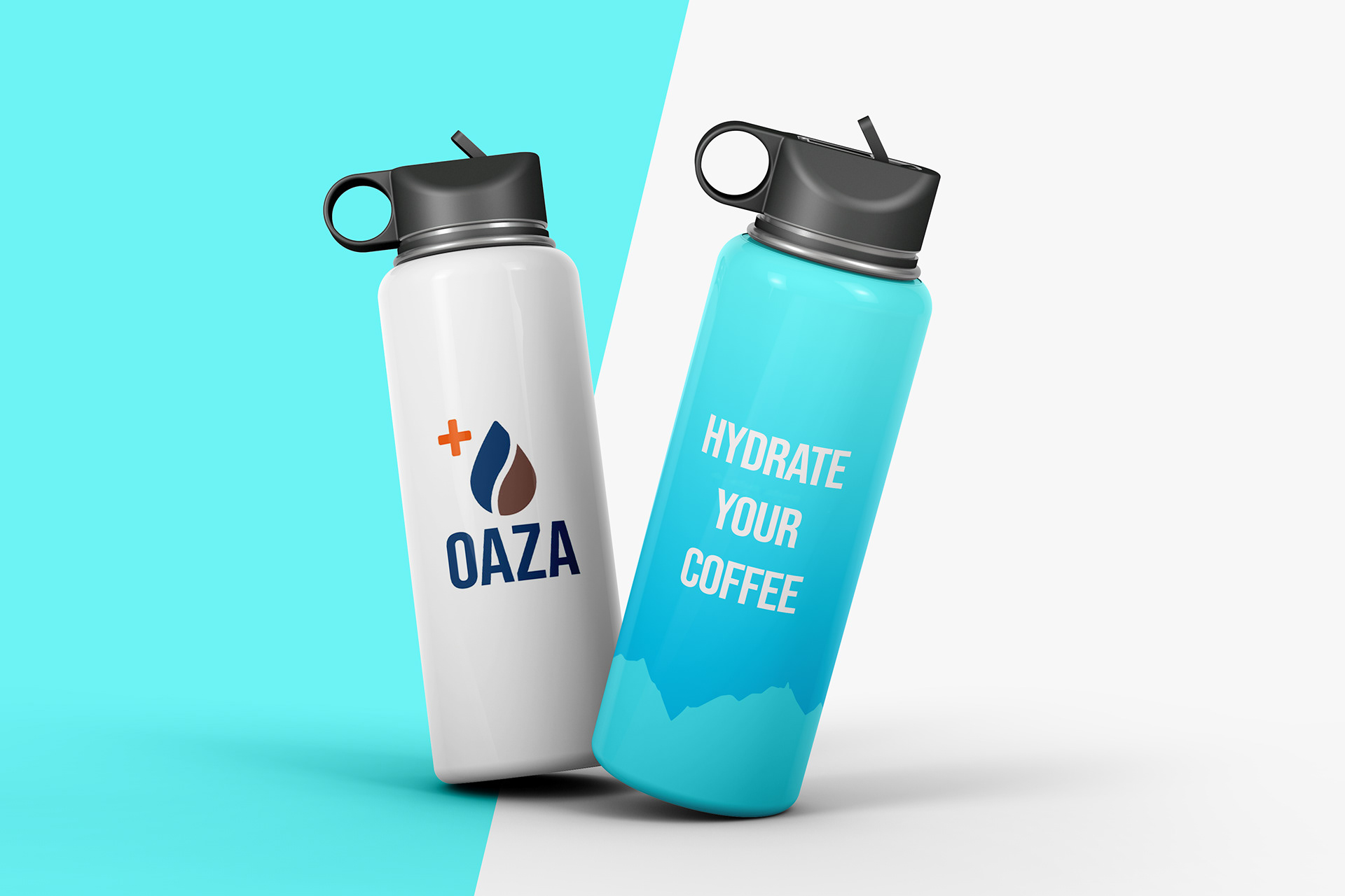
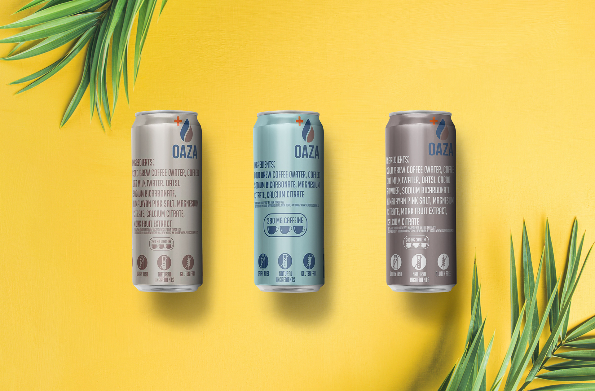
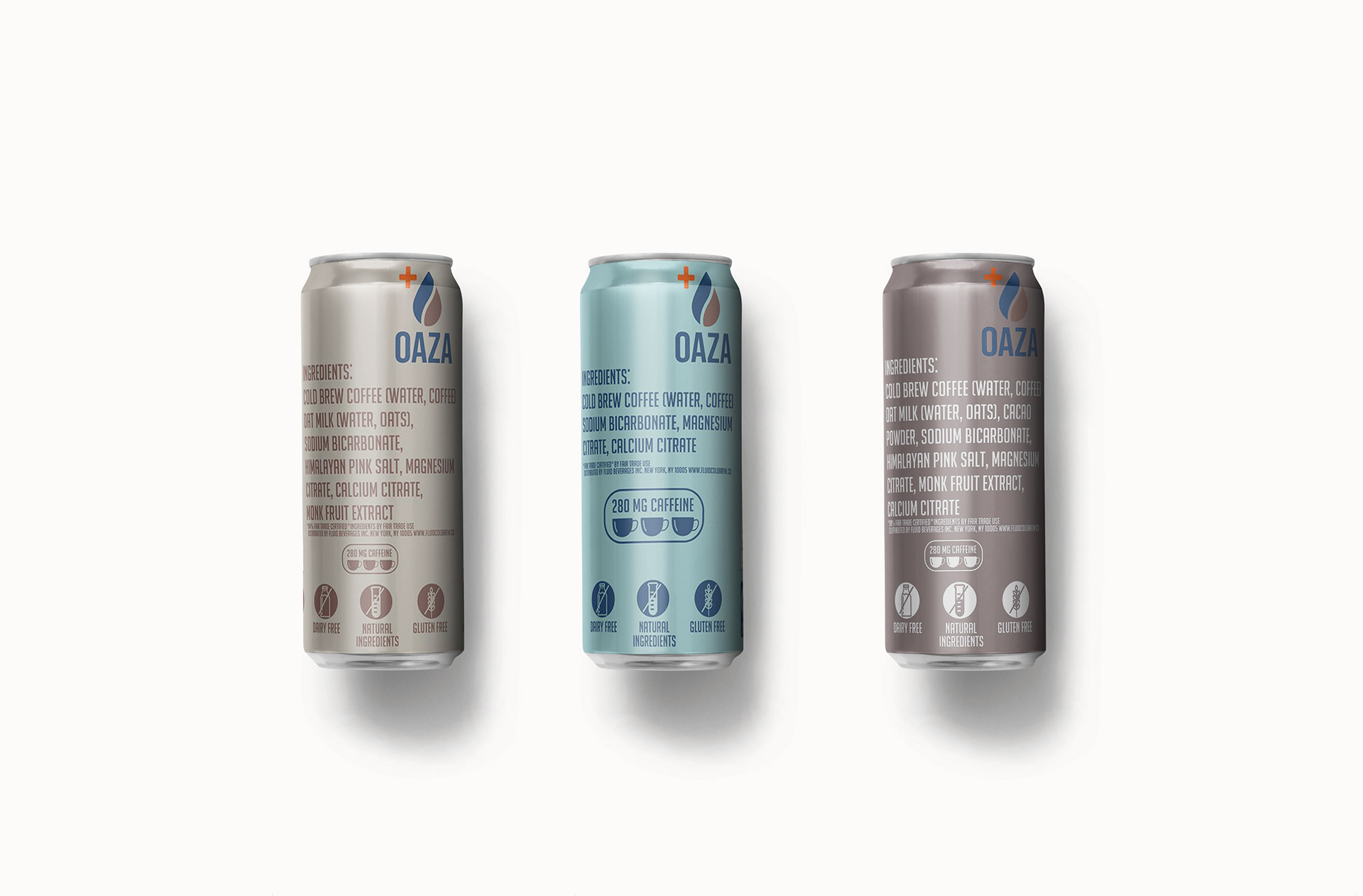
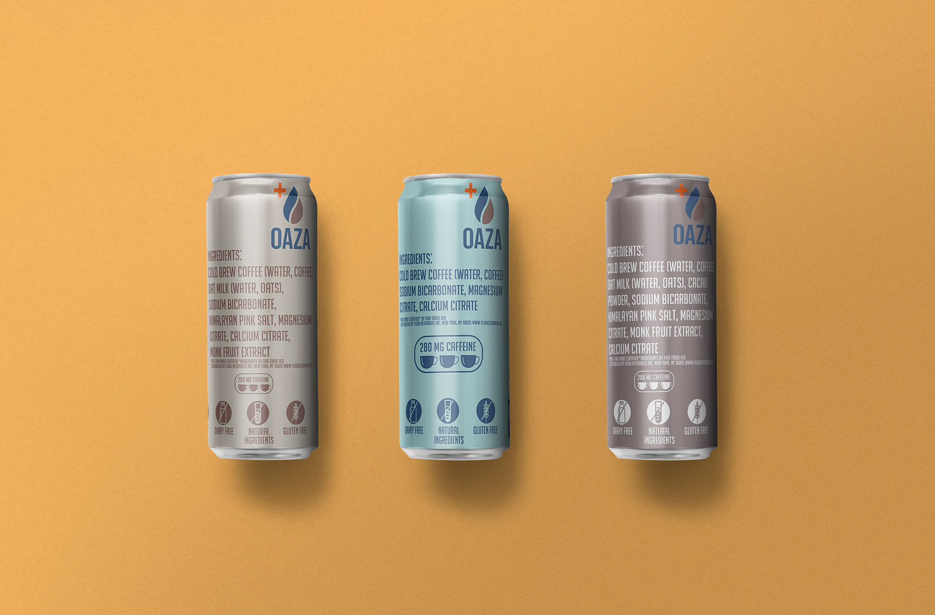
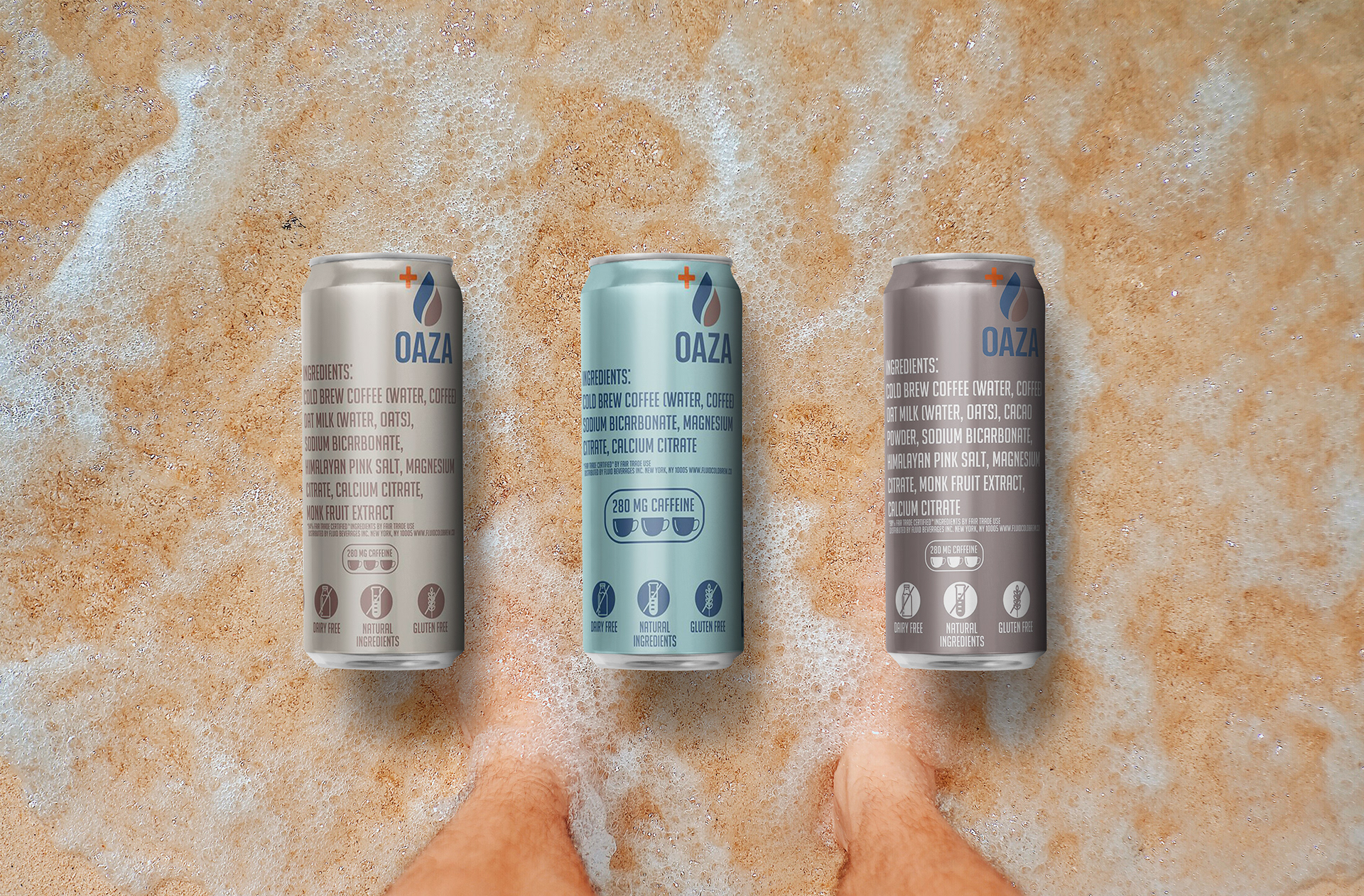
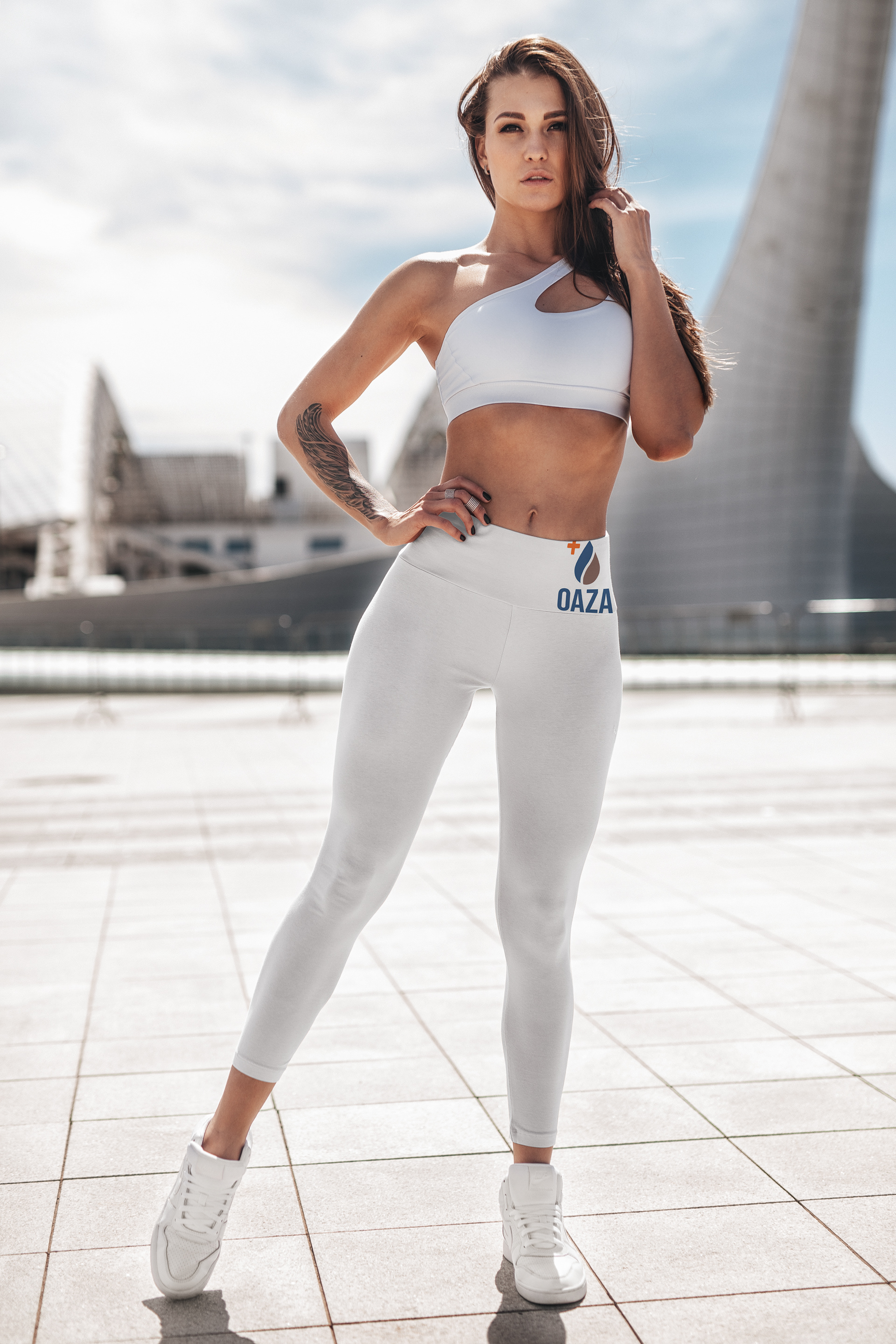
When we got involved, they had already had a new packaging redesign ready to hit the shelves immediately. They wanted their online presence to establish their brand values of wholeness, simplicity, and playfulness. They felt it was important to keep the same color palette and have a simple, modern can.
They talked about their logo and what it represented. They felt the water droplet reflected the balance of hydration and coffee. Their old branding had visuals with a retro-feel and a lightning bolt with some high-energy colors.
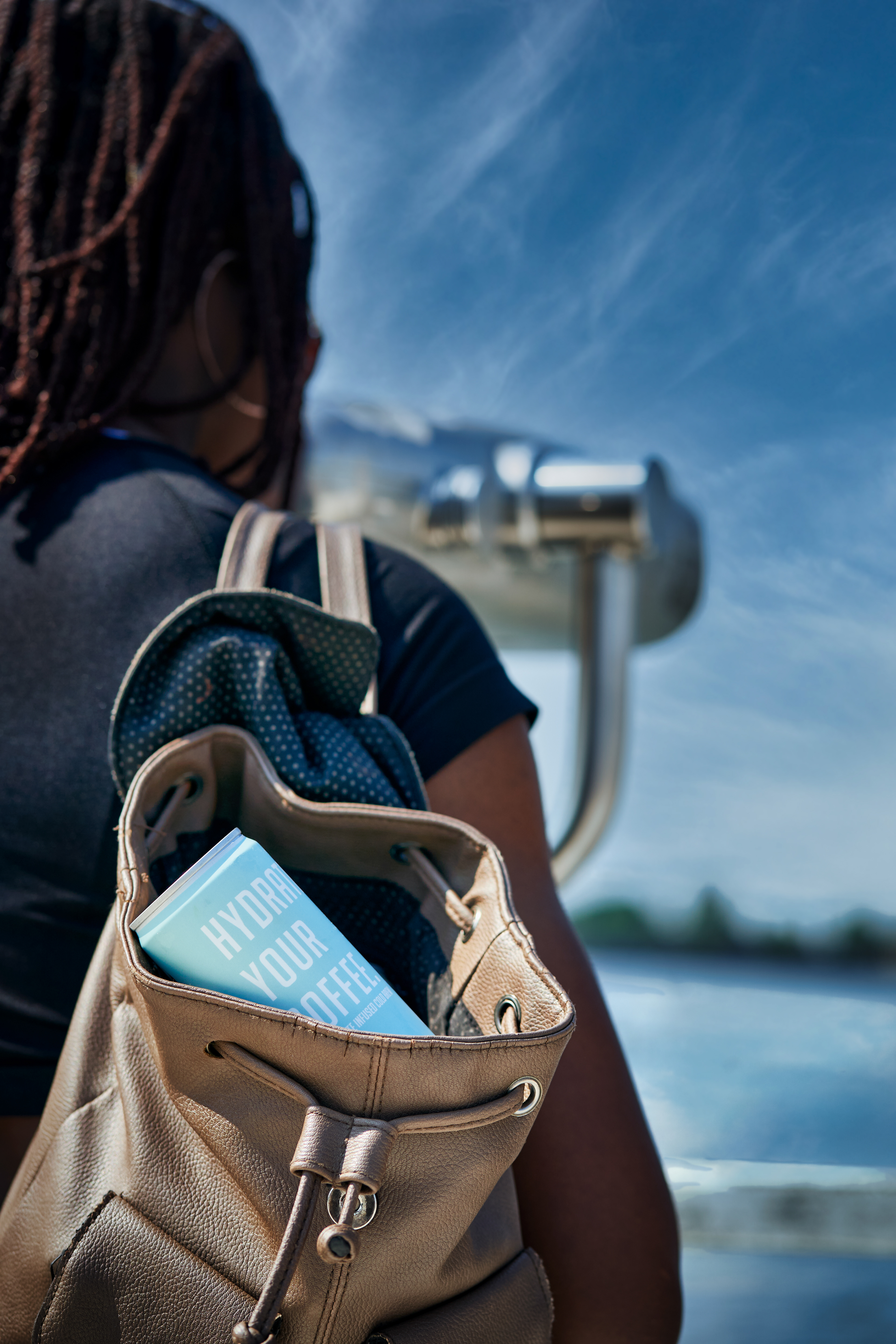
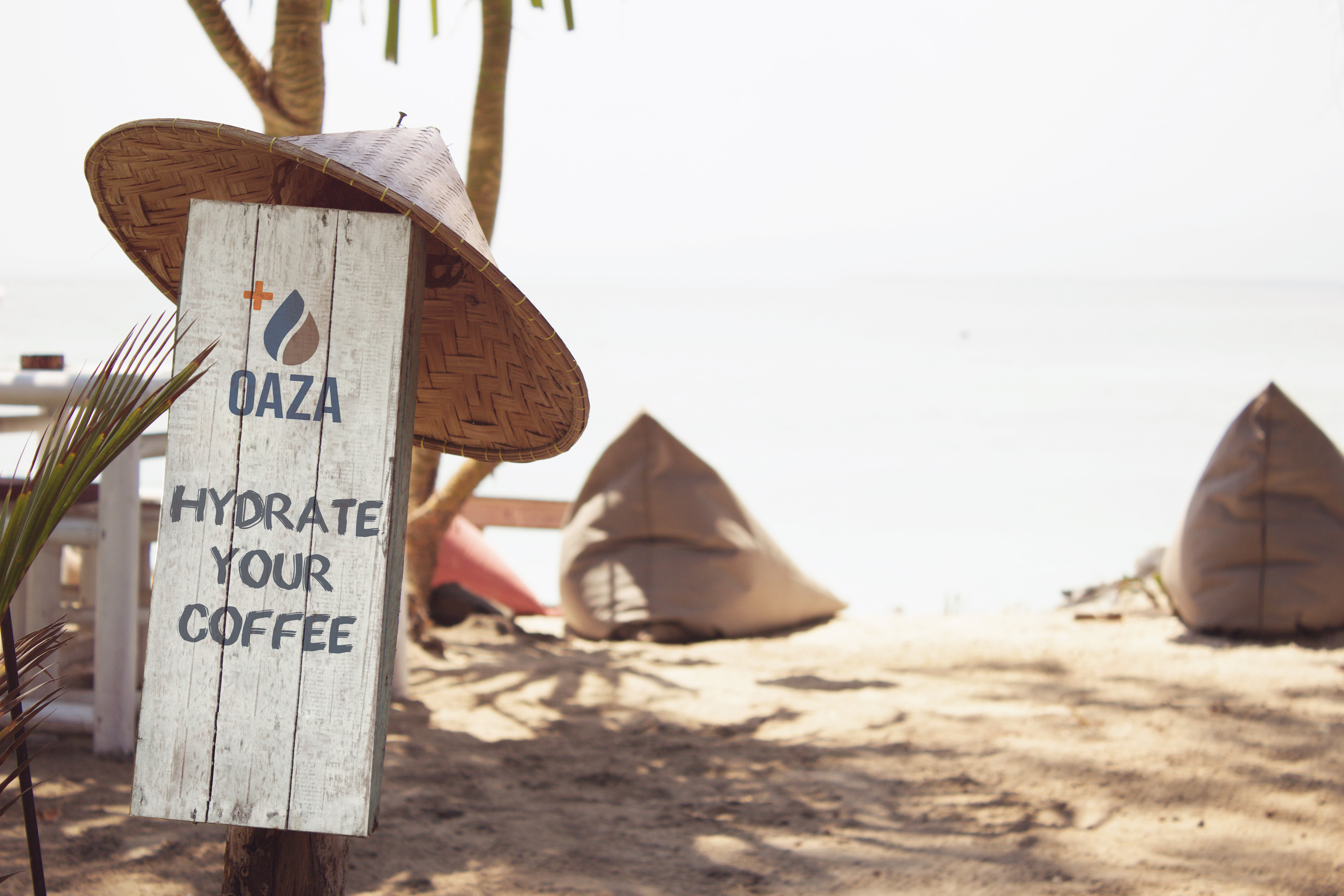
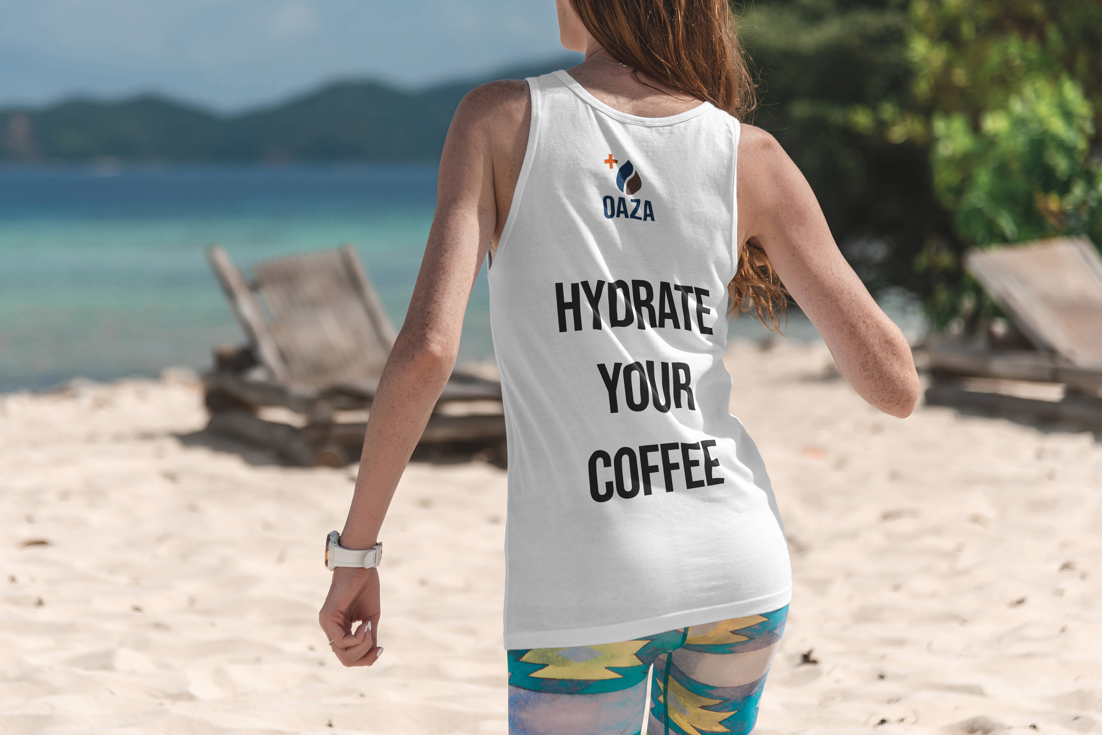
It was important for them to lean into their unique functional benefit of hydration and that they represent their name, an oasis... a beautiful place that you're excited to visit. With the brand slogan of "Hydrate your Coffee," they wanted to reinforce that throughout their new content.
We spent a couple sessions surfacing and prioritizing the challenges the company faced.
They found that their old look made them appear cheap, and from their consumer's perspective, a mismatch of price with their aesthetics. This was a barrier for entry, especially for those that were just seeing the brand for the first time. They always considered themselves a premium beverage and wanted their product and all their collateral to match that aesthetic. We shouldn't judge a book by it's cover. Yet, we still do buy into the marketing and tend to judge things at face value. (I know I'm guilty of it!) They needed a high-quality appearance to bring more brand confidence, and help that convert into sales and empower their customers to spread their message.
We were able to outline some goals and measurable objectives/results from our efforts. This became the framework for the rebranding creative direction.
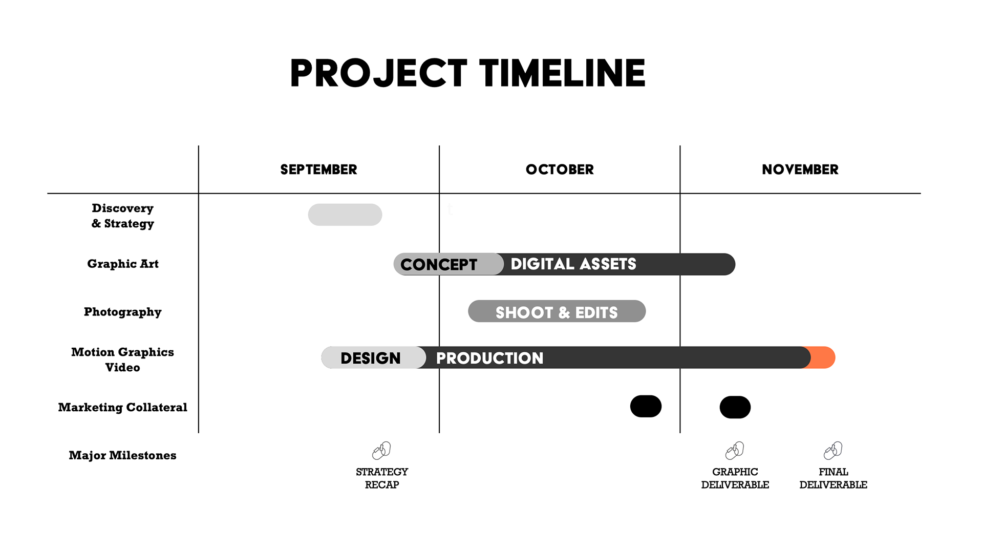
CREATING THE CONTENT
We laid out the priorities:
- Motion graphic video to give them some lively, dynamic content as the 'hero' content to reflect the brand's new identity; playful, energetic, and hydrating.
- Graphic art & photos that relate to their new identity and slogan, "Hydrate your Coffee."
- Static visual content that relates to their core values, playfulness, & simplicity
We got started with their core products. The content we created would be used for numerous applications. They would use it on their website's landing page and in blogs posts. For media opportunities, they wanted to have a media kit available that they felt confident in. When meeting with potential partners, they wanted to make a great first impression and showcase what their brand and the product were all about. And of course, they needed to advertise and engage with the customers on the social platforms.
THE Graphics
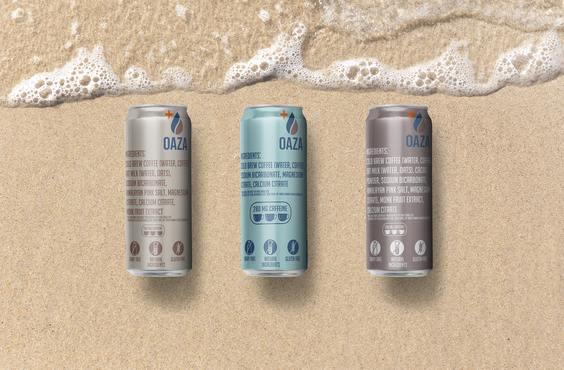
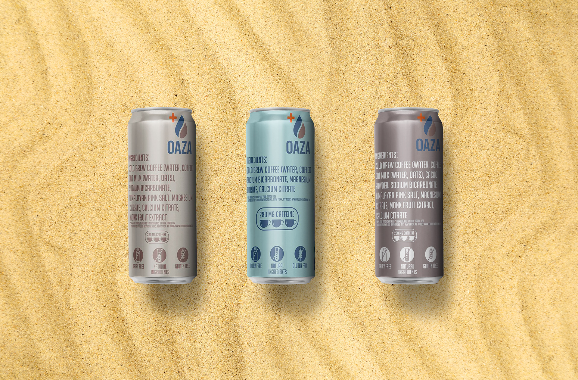
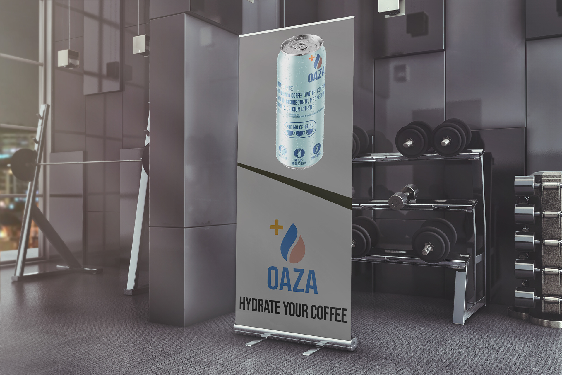
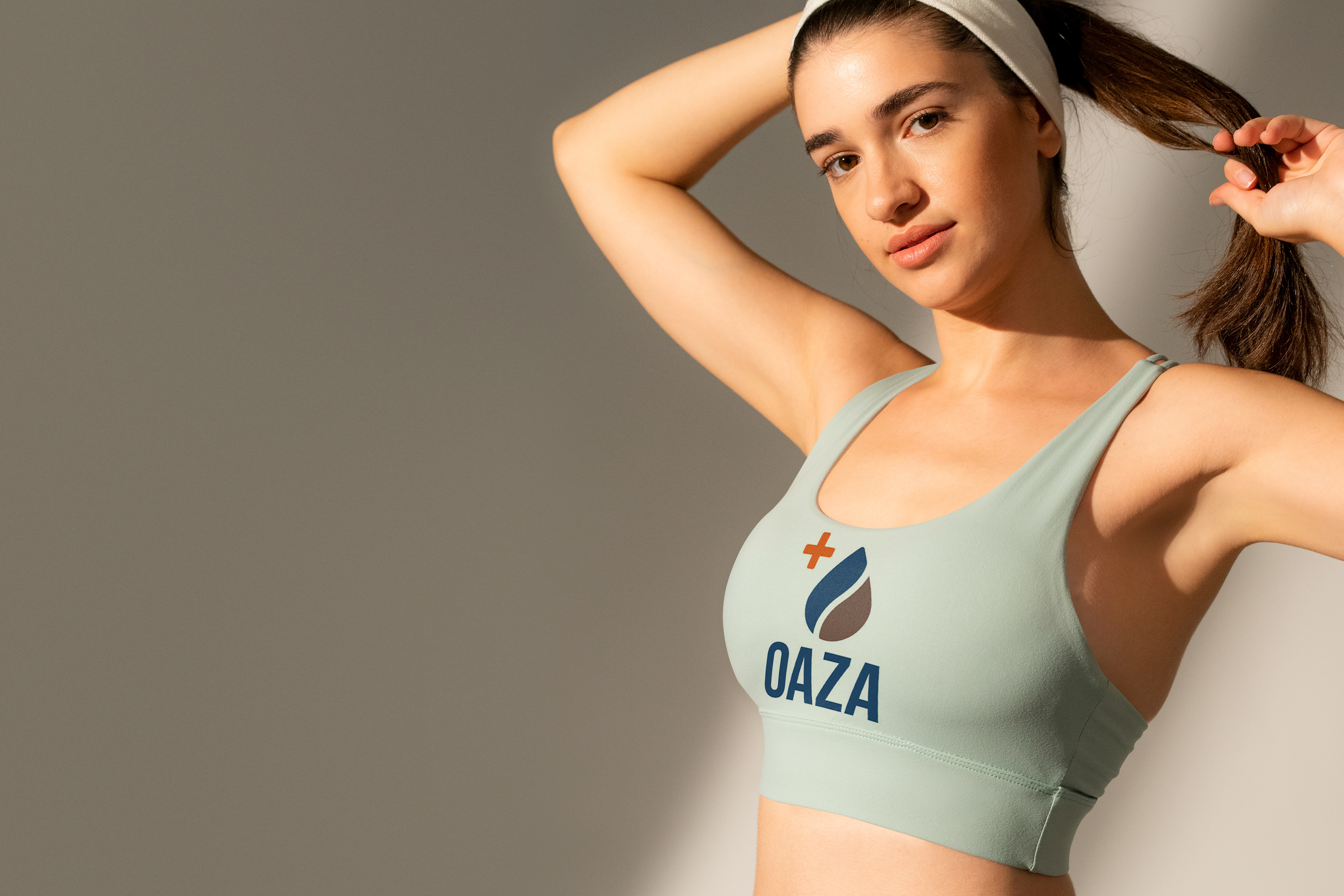
We put together many concepts to show a more playful and energetic brand. We tied in the sense of a desert & water to represent the brand's core identity. We showcased their evergreen products in exactly that way.
The athletic-focused consumer is really the brand's hero. This targeted group of people need to feel connected to the brand somehow and seeing it promoted with athletic wear and other signage like the gym & beach posters really help to empower their target consumer.
THE VIDEO
Rescuing Leftover Cuisine wanted to release a video for Giving Tuesday. We had 62 days to get a video out into the world. We had done some brainstorming of various concepts. We thought about having actors, or maybe scripting a short video. We even storyboarded a couple ideas. Finally, we all decided it was best to connect emotionally & authentically, with real people that each play a key role in RLC's purpose. We felt this would help RLC better connect & share their message with restaurants. Others should be more inclined to participate as they are seeing their fellow restauranteers and neighbors getting involved.
Gone are the days of 60 seconds ads. In fact, most are 6 - 15 seconds for social content.
Most people will stick around for an ad until it gets to salesy or loses interest.
We wanted to approach their video from a new perspective, something to catch the viewer's eye. A motion graphic video has a great visual aesthetic and allows any idea imaginable to come to life. It also gives an aesthetic of a high production value. We all see premium, well known brands doing things like this, and by association, we can help the consumer make those connections to the Oaza brand.
We also wanted to capture the sense of intense hydration, while showcasing the various ingredients of the drink; hence the use of oats & chocolate. We wanted to capture the vibrancy and fun of the brand that really showcased their ideals.
THE ROLLOUt
The day had finally come to share this video. They put it on the Fundraising website, Instagram & Youtube channel. They were happy to see such a high level of engagement on Instagram. They had a link in their bio that brought people to their fundraising & volunteer website.
THE Results
They have enjoyed a successful roll out of their new brand identity. They used the content as the core of their website & social platforms. They have also been able to secure more strategic wholesale channels & partnerships, like Amazon, and Juice Press, a national organic juice chain.
They were featured by Hungry-Girl, a blog, by a nutritionist who is also a NYT best-selling author. Oaza saw increased traffic to their website and social platforms. Through the improved aesthetics, there was improved brand confidence, a lower bounce rate, and an increase in customer conversions.
WANT TO WORK WITH US?

We really liked your work and will look forward to collaborating with you in the future! Thanks again!
- Jeff Burbank, CEO, Oaza Beverages