What does experience & expertise look like?

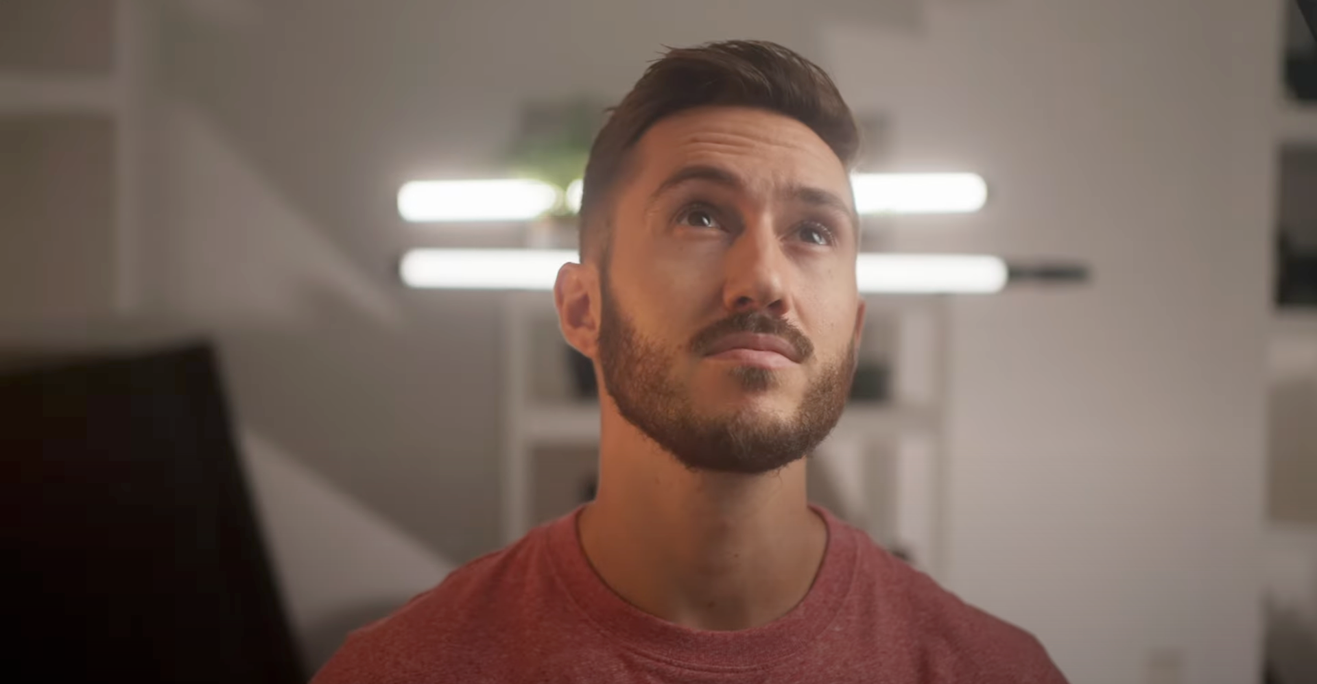
Original Look

Common Approach

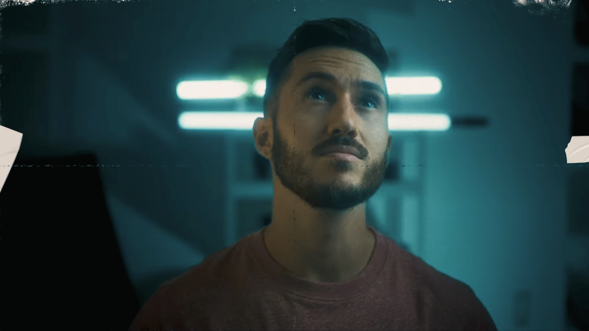
Bent Gate Media Grade

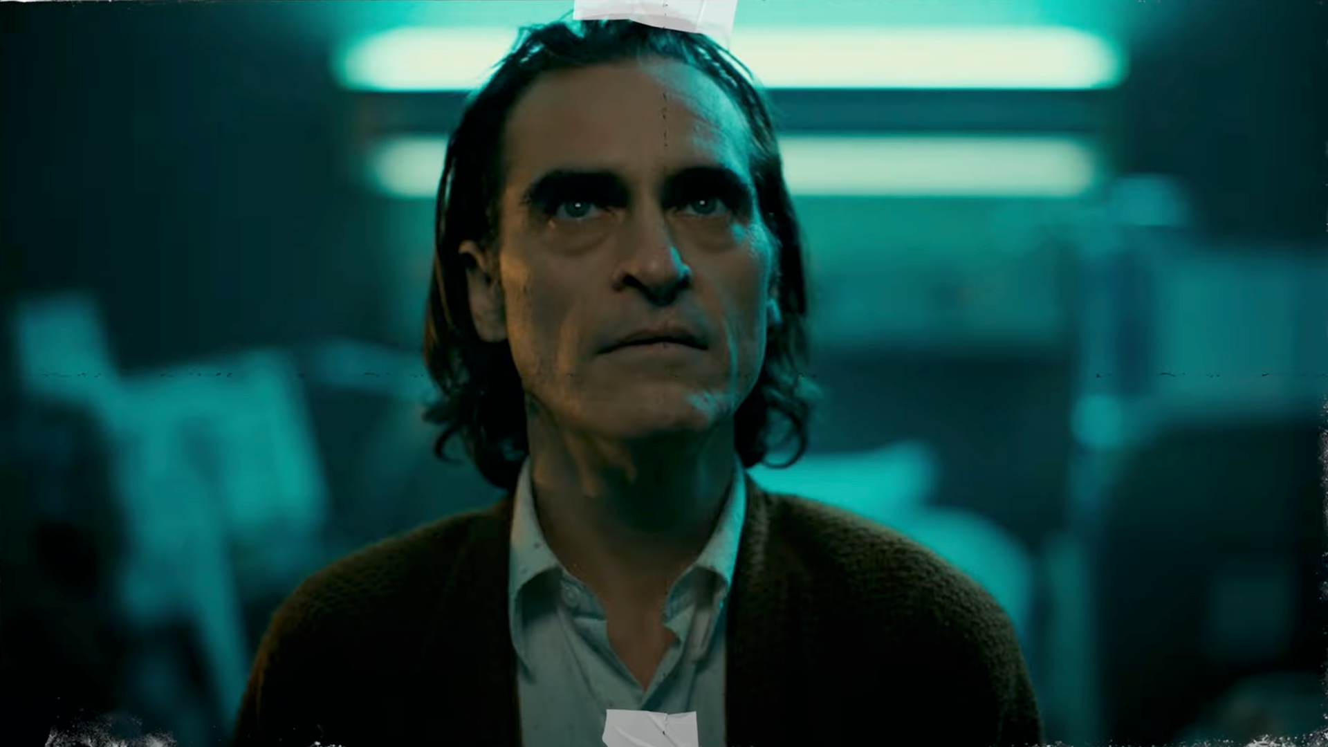
Reference Grade
The Joker look is an iconic look that many people have tried to emulate. A lot of people think to bring down the image, especially the shadows and give them this blueish cast. I would say for the untrained eye, you'll get 80% of the way there and you'll say it's good enough.
An important factor to consider is that this isn't just a color grade, but there was look development created for this movie. A lot of people get focused on just the print film stocks, with the classics like Kodak 2383. However, not only are there several 2383 stocks, which are not created equally, but also there is the negative film stock, which is an important factor that most don't consider. In this look, there is the Kodak Vision3 500T/5219 stock.
You'll find with my grade, that the skin tones match the warmth of the reference look, and that they maintain a similar contrast curve. When you look at the light, you'll find a bit more of that greenish hue that compliments the blue and gives a more authentic look to match the reference.
This is where our experience and ability to communicate with our clients makes the world of difference. We understand what is missing and how to get you exactly what you're looking for. In this case, we are making more nuanced adjustments to the image, but not by touching simple exposure, saturation, or contrast, but by working to recreate the look. We're matching the film stocks, tweaking contrast & color curves, and dialing the highlights, midtones and shadows to the look we want and that is how we get the density & creaminess that really makes our final image shine.
If you want to grab the film print emulation LUT I developed and stress tested, check out this link:
This is where our experience and ability to communicate with our clients makes the world of difference. We understand what is missing and how to get you exactly what you're looking for. In this case, we are making more nuanced adjustments to the image, but not by touching simple exposure, saturation, or contrast, but by working to recreate the look. We're matching the film stocks, tweaking contrast & color curves, and dialing the highlights, midtones and shadows to the look we want and that is how we get the density & creaminess that really makes our final image shine.
We are a seasoned pros in both film and commercial color grading. We’ve shaped images for multi-billion dollar corporations and some of the world’s biggest brands. As a thought leader in the color grading field, we love our craft and the people we work with, and have a deep understanding of both.
Need a colorist?
Hire us for your next project and work with a colorist who:
- Protects and elevates your creative vision
- Speaks your creative language
- Catches every detail to craft your best-looking image
Thank you!
From independent features to episodic series and commercials, Bent Gate Media's approach to color post-production blends artistry and talent with flexible workflows. We collaborate with filmmakers through the entire look development process to help bring their creatives' vision to life.
Color Finishing Services include:
⏺ Unique end-to-end imaging pipeline spanning camera & optics, dailies, & final color & delivery
⏺ Customized options for pre-production testing, look & texture development, & integrations into final color & VFX pipelines
⏺ Davinci Resolve real-time grading capabilities
⏺ Remote SDR & HDR color collaboration & real-time review available
⏺ High-speed connectivity to our location
⏺ Color management expertise including custom LUTs/CDLs, P3, Rec. 2020 & Rec. 709 color spaces
⏺ innovative & creative talent
WE Can collaborate on-site or remotely
What to Expect from the Color Grading Process
Initial Look Development
You ask us to develop an initial look. This is a great time to share reference images or looks/styles that inspire you. If you’re happy with the results, this then guides the look for your project.
First Review
After one or two more days, your colorist should send through their work for your first review.
Your whole project will have been graded with a broad brush, with the right look applied to it, and everything nicely balanced.
This is the moment to give detailed feedback, scene-by-scene. Do you think it’s too dark in this scene? What about the color of the sky or trees in the background? Is that car too dominant?
Second Review
The second pass should have all your first review comments integrated and should be very close to the finished result.
At this point, you should no longer give detailed feedback. Instead, you should step back and watch your project from the audience’s perspective, on the same screen and viewing environment they would use.
Ask yourself: have you achieved exactly what you intended? Do you feel the way the audience should?
Last Review
Once you’ve given the second pass feedback you should have the last pass. What you see on the third review should be the final master that you’d sign off on. You shouldn’t have anything big to change at this stage.
I hope this guide will help you in your quest to create the most beautiful images and working with a talented colorist is always going to be the way to get there.
WANT TO WORK WITH US?

