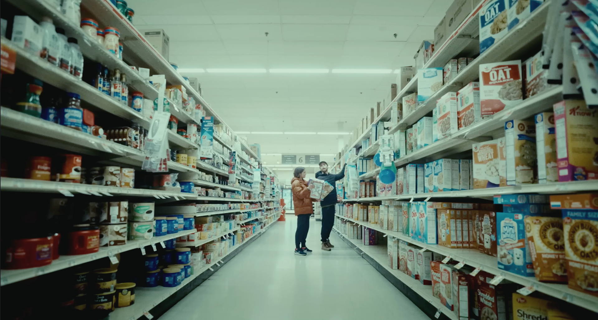
What does experience & expertise look like?

Original Grade

Our Grade
Reference Grade
Our Grade
Danny wanted to emulate the Euphoria look. What people sometimes don't realize is that it's not just trying to match the colors, saturation or contrast. You need to recognize how it was filmed and what film stocks were used. That is going to greatly influence the final color of your film.
In this case, we're talking about using 2 different film stocks. The first being the ektachrome 5294 film stock.
Many people nowadays talk about color grading like it's as simple as throwing a LUT on their project, or making some simple adjustments to the exposure, contrast or saturation.
I liken that to people that just throw a filter on their photos and consider them ready for the world.
If you're happy with that, then no need to read on!
However, if you're looking to elevate your project, then you need someone that knows how to ask important questions like "what look best serves the purpose of this project?" and has the ability to get you there.
This really comes down to having someone with the experience (& agility) to design your look. You'll look at this original image on the top right, and in the middle image we get it very close to our reference shot from the movie HER.
This can be done with a base LUT, some simple color correction, and you'll see we are pretty close to our reference shot. This is where many amateurs stop and think they have a color grade that matches the reference shot.
However, you can see that something is still missing. It still just doesn't match quite right, even though we're 90% of the way there.
This is where our experience and ability to communicate with our clients makes the world of difference. We understand what is missing and how to get you exactly what you're looking for. In this case, we are making more nuanced adjustments to the image, but not by touching simple exposure, saturation, or contrast, but by working to recreate the look. We're matching the film stocks, tweaking contrast & color curves, and dialing the highlights, midtones and shadows to the look we want and that is how we get the density & creaminess that really makes our final image shine.
We are seasoned pros in both film and commercial color grading. We’ve shaped images for multi-billion dollar corporations and some of the world’s biggest brands. As a thought leader in the color grading field, we love our craft and the people we work with, and have a deep understanding of both.
Need a colorist?
Hire us for your next project and work with a colorist who:
- Protects and elevates your creative vision
- Speaks your creative language
- Catches every detail to craft your best-looking image
Thank you!
From independent features to episodic series and commercials, Bent Gate Media's approach to color post-production blends artistry and talent with flexible workflows. We collaborate with filmmakers through the entire look development process to help bring their creatives' vision to life.
Color Finishing Services include:
⏺ Unique end-to-end imaging pipeline spanning camera & optics, dailies, & final color & delivery
⏺ Customized options for pre-production testing, look & texture development, & integrations into final color & VFX pipelines
⏺ Davinci Resolve real-time grading capabilities
⏺ Remote SDR & HDR color collaboration & real-time review available
⏺ High-speed connectivity to our location
⏺ Color management expertise including custom LUTs/CDLs, P3, Rec. 2020 & Rec. 709 color spaces
⏺ innovative & creative talent
WE Can collaborate on-site or remotely
What to Expect from the Color Grading Process
Initial Look Development
You ask us to develop an initial look. This is a great time to share reference images or looks/styles that inspire you. If you’re happy with the results, this then guides the look for your project.
First Review
After one or two more days, your colorist should send through their work for your first review.
Your whole project will have been graded with a broad brush, with the right look applied to it, and everything nicely balanced.
This is the moment to give detailed feedback, scene-by-scene. Do you think it’s too dark in this scene? What about the color of the sky or trees in the background? Is that car too dominant?
Second Review
The second pass should have all your first review comments integrated and should be very close to the finished result.
At this point, you should no longer give detailed feedback. Instead, you should step back and watch your project from the audience’s perspective, on the same screen and viewing environment they would use.
Ask yourself: have you achieved exactly what you intended? Do you feel the way the audience should?
Last Review
Once you’ve given the second pass feedback you should have the last pass. What you see on the third review should be the final master that you’d sign off on. You shouldn’t have anything big to change at this stage.
I hope this guide will help you in your quest to create the most beautiful images and working with a talented colorist is always going to be the way to get there.
WANT TO WORK WITH US?

